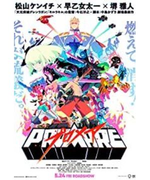
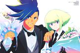
Trigger Club is awesome! Plot: Uh, the burning is over, and I didn't add any more to draw here: Trigger Club's beautiful comic style as always, exaggerated dynamics and human body structure, strong perspective, scribbled edge lines, quick mirror cuts, and just the right three renderings and two follow-ups "Shadow" style usage. The use of lots of irregular sharp triangles and polygons is also great. Color: Contrasting colors, but not uncomfortable because the saturation is well pinch (about 30 to 40 percent). In addition, the contrast is also obvious, and the bright places are estimated to be eighty or ninety. The single color used for certain occasions is also very appropriate! What I especially liked (I didn't see it in other animations of the Trigger Club, maybe because I didn't watch the national team?): The lighting and tone of the face when the big brother and sister-in-law were spinning on the ice lake. When the Promeas left, the edge of the triangle appeared the same as one or two pixels on the edge of the title, with high saturation and bright red and blue (this performance is very interesting)
The color that lights up when the engine is turned on matches everyone's screams. It's really hi! What came out are klk: wrapped flag (should), battle life fiber, war armor of Yuantou Mountain and "impossible" of Yuantoushan va, glasses blue short-haired male technical house Tianyuan: drill bit, big brother big sister, big brother's specific welfare action (big brother !!!Drilled to it!!!)
In short, it's very burning, and slowly absorbing color and pulling the tabs will definitely pay off.
View more about Promare reviews
