I was very pleasantly surprised to see such an excellent genre film that is so likable in terms of its advantages and disadvantages in the list of supplements in the second half of the year.
In the first half, it is embarrassing, exaggerated, overly pretentious, and illogical. But in the third act, it is fierce, arrogant, full of infinite image energy, and it is impeccable.
In my mind, this is definitely the coolest genre movie (one of) in the 10s.
The awkward smile and the acting skills of facial paralysis are reasonable expressions in this context.
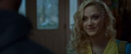
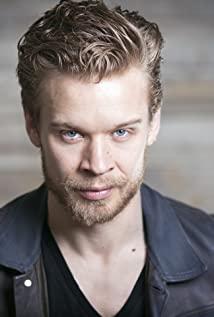
I have always wanted to complain about the acting of the male star Dan Stevens: from the moment this "uninvited guest" started, he almost always showed the classic "slanted smile" to express kindness. When expressing enthusiasm, smile; when expressing joy, smile; even under the expression of "little man's ambition", it is still that smile. It is no exaggeration to say that this smile can be regarded as the most representative "visual element" of the film, and it is much more eye-catching than "neon aesthetics", "plasma lens" and so on.
If I want to make it more vulgar, this male protagonist is too capable of "pretending", stupid and fun. And in certain passages, he actually performed very well. It was definitely not the kind of "pretending" without acting skills, but deliberately acting like this "pretending" to fit the style of the movie. To be honest, this is too " Engaged.
However, as the plot progressed, this extremely lame performance style began to exude a unique fascination: the combination of the perfect face of the character and the polite way of doing things generates a lot of weird look and feel, and it is mixed with violent scenes and evil charms. The solemn performance and plot trend are also verifying this perception to the audience. More importantly, when you wear the "tinted glasses" for this type of movie to watch, you will feel that those stupid and blunt plot arrangements become very kind, and the lack of logic is another effective humor. means. In layman's terms, the more contrived part of the movie, it turns out to be very cute in my eyes.
As a "weak plot, strong actor, attention to listening" genre film, "Uninvited Guest" is definitely a high-concept film with style first, and the family setting in it is extremely similar to other movies of the same subject: indecisive mother, work A troubled father, a rebellious sister, and an introverted younger brother who is often bullied. The film undauntedly directly quoted this standard family configuration template, in order to use the mediocrity of the plot side to set off the extraordinary of the audiovisual side.
For movies, this "amateur" performance style is also just right. Because for this type of B-level thriller, the visual and audio aesthetic presentation is the more worthy of the effort. The actor is actually just a tool in essence, or more precisely, a "puppet". As a puppet, what you do is to guide the movement of the camera, let the point of view follow you through different sets, and let the lights and costumes decorate your body. And at certain moments, the scene can only radiate energy when the characters live in it, not just pure matter. So from this perspective, the saying that "actors are tools" is a double compliment to movies and actors.
Editing, music, and action are the rhythms of the three.
The director appeared to be very restrained when it came to violent style presentation. You can see that most of the physical violence scenes in the film don't have any fancy action designs, or overwhelming mirroring techniques, none of them. In fact, the first two-thirds of the violent scenes in the film are extremely simple and direct. The action design strives to defeat the enemy with one move, and tends to burst out rather than continuously fight each other. There is also only one rule for mirror movement: "The actor moves, the camera moves again." Sometimes a large and rapid pan is used to enhance the sense of power and speed, but it is much more stable than holding it (most likely, Steadicam is used). As for the editing, I won’t explain too much. The short visual climax is formed by increasing the editing speed, and the decomposition of the action is not redundant, and it is quite capable:
But in the shootout at the beginning of the third act, the photography style changed from the usual and used a lot of slow motion as filling. On the one hand, as a gunfight scene, the rhythm and speed are much faster than pure melee scenes, so slow motion is needed as a conciliator and fully demonstrate the key action details. On the other hand, changes in audiovisual techniques can also subconsciously inform the audience of the transition between the second and third acts, and it is also an extremely effective tool for enhancing visual impact.
Of course, despite the introduction of slow-motion shooting, most of the editing of this shootout still maintains a high degree of conciseness. The director knows how to coordinate these two very different shooting styles to form a more exaggerated visual tension.
In terms of music, the soundtrack of the entire film is a retro style approaching the 1980s, whether it is a pop song or a pure electronic soundtrack. Electronic music adds a lot of color to the image. The constantly repeated and rising single melody is extremely sensational. The rhythm of the rhythm makes the image no longer monotonous. Whether it is a moving shot or an empty shot with a character, the gait of the character is also full of rhythm. beauty of!
The above-mentioned various audiovisual features will be condensed to an unprecedented height in the last 20 minutes of the school hunting section, which is also a decisive element for the film to become the best genre in the 10s.
The third act of incomparable cult, fanatical, extremely energetic type expression.
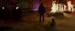
The third act of "Uninvited Guest" is undoubtedly excellent, and in this scene, the characters are completely reduced to "props", and the scene and lighting have truly become the protagonists of the film, exuding its charm.
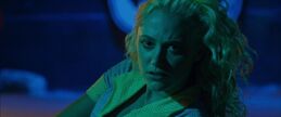
See how the scene works with the lights to achieve an evil atmosphere.
The mirror maze is no longer a new visual stimulus, but the spatial fracture and visual deception caused by light reflection can be extremely exciting at any time. This is exactly what "Uninvited Guest" pursues.
The role of the dry ice fog in this scene is extraordinary. The director accurately grasped the "deceptive" and "invisible" of this visual element, as well as the most critical "fluidity". It is precisely because of the director's excellent image awareness that the fog adds a lot of movement to this scene, which can be called an excellent scheduling case.
In the second half of the scene, in terms of the overall image style, the closest thing is "Carrie Witch": a hand stretched out from the mist/hand stretched out from under the scorched earth; the burning school hall, accompanied by gorgeousness The background lighting; and the same horror setting at the end, it is very similar.
However, the complete effect presented by "Uninvited Guest" can not only be described as "learning" and "tribute". how to say? If you have to make an analogy, it's just like what Leone did when filming "Once Upon a Time in the West". It is by no means simply borrowing from a certain scene of a certain film, but relying on the creator's long-term accumulation of experience in this type of movie. The author instinctively conceives, arranges each scene, and stitches it into a complete movie. The same is true of "Uninvited Guest". It is not only a crude and direct tribute to "Witch Carrie", but relies on the viewing experience of a group of B-level thriller/horror movies to extract art, scenes and The commonality between the lights, the final visual effect presented is so refined.
As for the cheap reversal at the end of the film, I think it is necessary to think about it: from a conventional point of view, this is counter-logical, absolutely stupid, and is another decisive proof of the "bad film". But for this type, this genre, this kind of plot setting is extremely conventional, and even conventional to the point of reasonableness.
As Palma said, this kind of almost "cookie cutter" plot reversal and jump scare are part of this genre, whether they are reasonable or stupid.
The interesting thing about "Uninvited Guest" is that in this respect, it almost completely implements the template routine of the genre, which is as standard as propositional composition. But this kind of "stupidity" is obviously deliberate, to ridicule this type of routine model with an attitude of participation. Once you understand this level of creative intentions, all the "unconventional" and "anti-logic" points of the film suddenly become very cute, so it becomes a matter of course for the audience and the creative team to "create self-confidence" together.
For the presentation of the fascination complex, the audiovisual essence of a certain passage of a movie is truly stripped out, and then it is integrated into the context of the film narrative in a free way, capturing the essence, not just the lines. Or a simple and rude quote from the scene, advanced and pure.
View more about The Guest reviews
