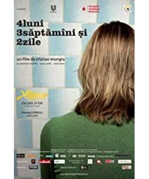
last year’s Cannes’s 60th Anniversary Palme d’Or, of course, I saw it the first time the rip came out. It was just very good, and then its charm began to manifest in the next few days. Even if it was separated from the story, the language of its lens fascinated me not long ago. I remember that the last time I saw a similar scene was after watching Talbella’s " Whale Circus. Stop talking nonsense and just take a screenshot.
The beginning of the film starts with a window setting, and then there are two girls with dual symmetry. The protagonist and the supporting role have a dialogue on the table. The composition is very standard academy. It may not be very powerful when you look at the title. When I wrote it down and saw the end, I found that this design is really ingenious. Moreover, the design of these two female characters coincides with the double life of Lao Ka's Veronica.
A long shot of the heroine walking out from the door of the girls' dormitory to take a ride, a textbook-like long shot, from the front facing her out of the corridor door, walking to the side, following behind, and getting on the bus in the distant view. And when it’s different from a complete camera still, it’s obvious that there is movement and the rhythm of the shooting, which is more ingenious. It is also very bright at first sight. After the movement and the shooting of the heroine straddle the arch in the middle of the picture, the camera Stopped, let the characters walk towards the distant bus in a still frame. The whole long lens is made together, combining movement and static, which is very eye-catching.
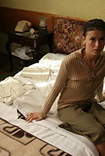
The scene of the heroine’s hotel booking room is again a very standard symmetrical composition, with small details, "cigarettes" placed near the focus of the character’s face, and an asymmetrical segmentation with the ashtray in the middle. Very concise and refreshing composition
scene where the heroine calls another girl in the article who is contacting her roommate's abortion doctor. The dialogue design did not use the usual traditional method of inter-playing between the two characters to show each other. In the previous scene, a half-length male was used to make a phone call. Immediately cut back to the main line of the heroine, and did not give the girl a chance to show up. Looking at it, I know that this design is also intentional.
There is a scene after the heroine joins the abortion doctor. The depth of field is very well designed. The heroine rolls the car window to this position, just to reveal the abortion doctor’s upper body and the small head of his mother sitting in the corner. This is how the character has a point of view.
The three people talked and quarreled about the cost of abortion in the room. This indoor conversation was filmed in Godard's style. In the conversation, the camera often only paid attention to one of the people, rather than the traditional way of who said to whom. , The sound outside the screen and the close-up of the character's expression form a very good sound separation effect. After the quarrel, the heroine finally agreed to go to bed with the doctor for her roommate's abortion, even her aunt was here at this time. Before going to bed, the camera was changed to the person’s line of sight of the roommate. The first picture above was the first person she saw before they went to bed, and then the camera switched to her third person. She closed the door of the room, which was a very thoughtful design. Then the audience will spend a very difficult and emotional few minutes with her outside the room and in the bathroom (the key prop of interstitial smoke). To quote a netizen, these few minutes were the most anxious and saddest in his movie-watching career.
Mirror, see mirror again. Small rooms can also have multiple levels of depth of field.
The indoor shots in April, three weeks and two days are really good, often the depth of field is very layered, but it is not a design similar to Cai Mingliang's peeping, but it can take the audience to actively follow the characters with their eyes. Progress, feelings and feelings, the
heroine then went to her boyfriend’s house to attend his mother’s birthday party. During the meal, the heroine who missed her roommate’s abortion absent-mindedly listened to the guests’ conversations and ridicules about the political and social status quo. It is also the only place in the film that has a political flavor, but it appears very cleverly. Here is a long shot of a dinner table conversation. The composition is very good. The guests and the audience who have been talking for two years can only see their hands and heads that faintly appear on the edge, while the absent-minded heroine is placed in the golden focus of the lens. Location, the placement of cups and wine bottles on the table highlights the awkwardness of her focus, and her confused boyfriend is on the first floor behind her, and her boyfriend’s parents are on the two parallel floors, and the background is the entire bookshelf. . The meaning came out immediately.
The heroine hurriedly left the previous paragraph. In the confusion and misunderstanding of her boyfriend, she waited for the elevator very real and touching. She told her boyfriend please don't look at me waiting for the elevator like this, she couldn't bear it. A small climax of the film's emotions, when it was watched, it was severely incited.
Like the captain lens of the heroine walking onto the bus at the beginning, another long lens design moved from the textbook, with more lighting content. The heroine walked up from the dark sky bridge to the camera just under the light, then turned her back to the camera and disappeared on the other side of the sky bridge. There were also movement and static rhythm changes.
The heroine returned to the hotel, and her roommate told her that the fetus had come out. This was her facial expression after leaning over to the bathroom and seeing the fetus. It was a very long close-up with a mixture of fear, surprise, and maternal facial expressions. It is more flavorful than the scene where the fetus jumps out directly, and then the phone rang from the room outside the screen, as an excess, the heroine gets up and the camera falls sharply, and then the fetus close-up.
At the end of the film, the heroine returns to the hotel after abandoning the fetus, finds her roommate at the table, and sits silently opposite each other. The story returns from the heroine's line to the dualistic symmetrical composition. Seeing this picture, and recalling the beginning, a very good coincidence, even the placement of the props and cigarettes is the same.
When I was still thinking about how the film would end, the director gave a very smart comparison. After the two sat down, there was a car coming from the corner of the street from the camera position. Pay attention to the glass on the right side of the woman in the picture. At the small aperture and the small aperture on the left side of the woman in the second picture, the roommate calmly looked at the newspaper as if nothing had happened, but the hostess turned her head to look at the direction of the camera. Then there is the black screen video introduction. Very good ending. Although the previous movie was based on the heroine as a clue for a long time, she was always in the perspective of the audience paying attention to her in the camera setting. At the end, the camera facing the camera gave her a spiritual communication with the audience. Suddenly we were in The audience of the bystanders felt that she was right by our side in the play. It was a real thing that happened. She was in real life just like us. In contrast, the classic ending of Fellini's Night of Kabylia, she walked towards the camera with a smile with tears on her face. There is also Rosetta, the Palme d'Or in 99 years by the Danes. At the end, the heroine who has never faced the audience suddenly turned her face to let us see her tearful smile.
This concludes the screenshot. Even though it is only the director’s debut in April, three weeks and two days, no matter from the narrative, the language of the camera, and the actor guidance, it shows his very deep academic foundation and European art film tradition. In this film, we see Godard-style indoor characters’ dialogue voices and the separation of the picture, and see the Dannet brothers’ real care for the protagonist, the two heroines seem to be designed with two sides of human personality. It coincides with the double life of Old K's Veronica. So in the 60th Anniversary Cannes competition, this film can stand out and win the Palme d’Or. I think what I see from it is not only the revival of Romanian films, but the continuation of the entire European film. The movie does not die, it has the best interpretation in it.
View more about 4 Months, 3 Weeks and 2 Days reviews


