Some people may ask: "Why did you watch it twice so bad? You are a boring diaosi who likes to abuse yourself and watch movies just to scold?" Certainly not, the reason is very simple, for the material. I am an amateur writer. In my spare time, I will write some anime reviews and submit them everywhere to earn some extra money. So what material do I want to find on Firefly Forest? Very simply, there should be no counter-examples of "xxx" in animation production, because I found that this work has already made every difference in the production level. So in the future, I will give counter-examples. For example, the works of xx are very good. On the other hand, the "Forest of Fireflies" is done in this place...it will be very convenient for my writing. So looking at it from another angle, the Firefly Forest has actually helped me a lot, so let's get to the point
:
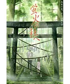
1. Light and shadow problem: I remember that there is a bridge section in which the male and female protagonists face each other in front of the archway. I gave a big close-up of the heroine. The camera first freezes on the heroine's feet, and then moves up slowly. In this shot, the background is the scorching sun, but there is no shadow under the heroine's feet, which is simply touching. If it is a "shadowless animation", it is very normal, but this work has shadows in many places, which is shadow. There is also light: when passing through the woods, the brightness and density of the light spots on the ground, as well as the distribution structure pattern, are the same. Are the leaves in this forest all the same? Let’s give an example of each of the light and shadow. In fact, there are many light and shadows in the whole film. I will also give an example of each of the following questions, because the entire work is simply an animation and should not be an encyclopedia. If all are mentioned, my typing time may exceed their animation production time.
2. Out-of-shape problem: Japanese animation is a popular thing, but the out-of-shape phenomenon of the characters in this work has almost reached the peak. The body and face deformations that can be seen everywhere give me a sense of joy in looking at fun mirrors.
3. Lens problem: The lens movement rules, shooting angles, and conversion logic of this work are simply stupid. As everyone probably knows, the lens is generally to imitate human eyes, or to give a third-party perspective to express, sublime, and deepen a certain emotion. But is the language of the shots in this work designed to make people aware of the director's existence and make people think he's stupid? When the hero and heroine met for the first time, the heroine just heard a strange noise from the confusion, and when she looked back, she found that the male lead's performance on camera was worthy of the Golden Raspberry Award. The camera pans slowly → finds the male protagonist → slowly pans past the male protagonist → slowly pans back → faces the male protagonist. Is the logic of such a set of shots proving that the heroine is stupider than a sloth? Whose visual habits are like this? Or is this a third party perspective? So what is the purpose of this cumbersome and slow expression?
4. The original painting is reused: It is normal for the leaves to always skip at the same frequency. In TV animations, they are very happy, but doing this in the theater version is already dissatisfying. However, what is even more outrageous is that in the fair of fairies, what kind of mentality is it to put a pot of goldfish in the same action twice? Show others that you can complete the feat of 5 small fish swimming at the same time? Director, you are not stupid, you are really stupid, okay?
5. Background problem: The various backgrounds are as motionless as the set, and the blind man sees them all and does not explain them. Are those people in the work all model dolls?
6. Scene layer problem: There is obviously a problem with the color brightness of the scene layer segmentation in this work. If the brightness in the distance is stronger, even if it is blurred, it will still cause the audience's visual focus to be deviated. Moreover, the segmentation of the scene layer is too inconspicuous.
After talking about the animation production, I believe that everyone should have no objection. After all, the animation production level of this work is obvious to all. But I'm sure there are people who feel that this work shouldn't be given such a low score.
The reasons for liking this work may be said:
1. The story is good
2. There is connotation
3. The style is good
4. I just like it
4. First of all, for those who "I just like", I support you 100% and continue to like it, It's just that our tastes and tastes are different, and we don't need to continue to communicate
3. The style is good, or the style of painting is good. I still don't know what is a good or bad style. This kind of style, which is mainly fresh and elegant, with backgrounds processed with photos + blur filters, and simplified and beautiful character styles, is just more popular. Compared with other artistic styles or expressions, their advantages and disadvantages are almost equal. So who can tell me what is good style? What art criticism theory? What is the logical chain of thinking?
2. This work actually has no connotation, just a simple story. Every time someone tells me that xx films have connotations. I will always ask: "Where is the connotation reflected?" If the other party can't answer, or say: "Anyway, I think it has connotation." I will think that the other party is 100% funny. If the other party randomly cuts a piece of chicken soup for the soul of his YY, such as: "That night...my egg was deeply broken again." Then I want to ask: "This thing is called connotation? Is your logic for evaluating connotation swollen? Like?"
1. Where is the story? up? Have a commitment? Have a turn? fit? Are you angry? Powerful? Affectionate? Rhyme? Have a surprise? creative? Have a bright spot? Such a simple but not minimalist work. From what stylistic structure can it be seen?
Of course, this work has its good points and successes:
1. It shows the simplicity of modern people's aesthetic taste
2. It once again proves the IQ of some Chinese movie audiences
3. Commercial success
, thank you!
View more about To the Forest of Firefly Lights reviews


