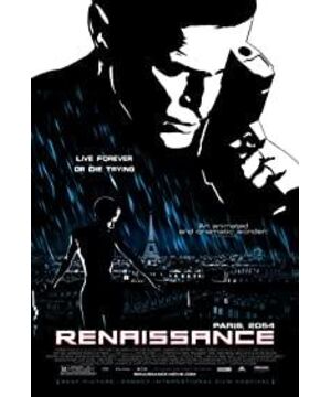
Since all grayscales are stylized as simple black and white, the whole picture takes on a knife-cut effect. This effect may be to highlight the highly electronic (0,1) of the future society, or to indicate that the traces of life should be erased in order to highlight its ideological nature.
But in general, I feel that this image-style sculpture is not very perfect in combination with the theme of the film to be expressed, compared to Sin City. One can't help but wonder, does it need to be shot this way?
"Resurrection" tells an almost old-fashioned story about a scientist who goes missing, and the police gradually uncover the hidden truth as they search for her whereabouts. There is a distinctly French cinematic character that can be seen in the film, but this character seems to be out of place in the black and white style.
The real purpose of the film is to discuss the topic of immortality and death. Scientists discovered the secret of immortality, but finally gave up all research results and kidnapped the female scientist who was close to the secret. The reason is that "life has meaning only when death exists", or in other words "if man is immortal, life has no meaning". This proposition seems to come from Beauvoir's philosophical novel "Man is always going to die".
It's a very deep and controversial proposition that the movie doesn't discuss in depth. But it is very simple to make the police immediately agree with this point of view. This makes the film lose its core and become superficial.
View more about Renaissance reviews


