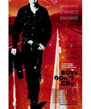
The tone is so blue, how can I put it, it's like a dream, but it must not be a sweet dream... It's also cold during the day. For a cool-toned movie, I think the best use of color is "The pianist". Iron ash is both tragic and strong. Compared with "Boys don't cry", which is not deep enough blue, I like the orange of the poster.
I really don't like the soundtrack. Even in the beautiful passages, the soundtrack is filled with horror. The sound didn't have the effect of confusing me, but made me yawn again and again, and then suddenly shiver.
But the part where they just met was not bad. Brandon takes pictures of Lana. Photography is the best opportunity to cover yourself and spy on others, but this spy is naughty. Under the night, the light shining on the two of them through the fence is as beautiful as a fairyland.
The second half from dream to reality, cruel, but not bad, at least I don't doze off.
The more the tragedy, the less tears. The shock is still there. But come to think of it, it's probably because I'm not used to the sensational way of American films. No matter how much I like "The Hours", I didn't squeeze out a single tear.
What I don't understand the most is, why is it "Boys" and not "Boy", is there any metaphor?
View more about Boys Don't Cry reviews
