I think the techniques here fall into two categories, techniques for narrative suspense setting, and techniques for lens language representation.
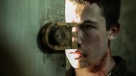
Some people may think that the scene where the old man drags the heroine at the beginning of the movie is a bit tasteless, but this just reflects the director's positioning of the movie, he just wants to create suspense. There are usually two ways to create narrative suspense. In simple terms, one is to not tell you what happened, and you need to watch it step by step to discover the ending yourself; the other is to tell you the ending directly, but you still need to watch it step by step. , to understand how the ending came about. Both methods are used by directors. At the beginning, I told the audience that the heroine would be dragged back. As for how to escape and how to be dragged back, see for yourself; but when this scene did not happen at the end, obviously, this is telling you again, Wait and see and there is a reversal.
(So for the heroine's character design, the director doesn't seem to want her to be more lovable. She only needs to have points that trigger suspense. The obsession with money bags seems to be a technical requirement, not a plot requirement.)
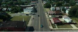
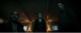
For For the lens language part, non-professionals dare not comment too much. Just a few personal feelings. The director's successful handling of space makes the film have a lingering sense of depression. There are few outdoor parts in the film (even the outdoor is an unmanned town as gloomy as the indoor), from the house that was successfully robbed by the protagonist at first, then the protagonists have a conversation in the car, then their respective homes, and then the story takes place. The main location - the old man's house. . . Even the last scene is in a closed room with the same dark airport hall. The second is a mixture of several dark tones. The movie does not default to a dark background from beginning to end, but switches various dark colors such as dark, red and black, gray and black through changes in the scene and perspective, and it is very suitable for the atmosphere of the plot. When the old man decided to kill the killer to seal the house, thick black was introduced in a large area, and the plot reached a climax.
In general, technically successful movies are the best for movie theaters, and without the visual and sound effects of a movie theater, the look and feel will definitely be different. (Yes, I just didn't go to the cinema, so I can only get a three-star -_-)
View more about Don't Breathe reviews
