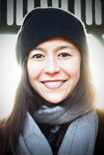
After watching this episode, I think it is the best episode of the first season. It talks about a font designer who has his own unique opinion. He likes to add words to the photo to describe this photo. Let everyone remember these fonts. Some fonts from tall, short, fat and thin people to tall, short, fat and thin represent such people, and his marriage is also enviable. His husband and his work do not disturb each other. Achievement. And she has a small hobby, which is to draw maps and add dense fonts. His expression is the icing on the cake.
View more about Abstract: The Art of Design reviews


