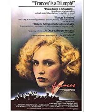
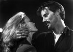
A film's sets, locations, costumes, and props are admired by the audience, and an art designer is often admired for creating the right atmosphere for a film. But audiences hardly realize how many steps a design takes from conception to realization on the screen. Every designer has his or her own way of working. Richard Siebelt, the art designer of the film "Francis," said in describing his method of work: "Every time I make a film, I think of a piece of music: what is the instrument to play, is it a symphony or a concerto, Belongs to that era, is it classical or romantic. For me, "Frances" is a romantic piece, and its bizarre music contrasts strongly with 'opera clowns' like "Champo". When When I did "Chinatown," I was dealing with a brass concerto, a well-crafted piece. My "Knowledge of the Sensuality" was an absolute chamber music. I was reading "Francis" I realized when I was writing this book that it was a concerto played by very emotional stringed instruments: violin and cello. It was a story I had been looking for. It was about a girl who came home again and again. In the sonata form invented by Mozart, there is a form of 'restored (going home)', that is, A–B–A–C–D–A. Music starts from a certain motive and turns to another motive. Then back to the first motive (home), then to a different motive, then back to the original, and so on, and finally ending at the original motive (home). When Mozart couldn't achieve the reduction, he always added another Last epilogue. This story fits that perfectly. This girl started at 16 and went to Russia, New York, Hollywood, came home a star. She left home again, went to Hollywood and New York, and came home again in a mess The third time she left home was in a mental hospital and then came back home. In the original script, she ended up leaving home and went to a mental hospital and never came back. The ending here is that, eight years later, she served as the The host of the 'This Is Your Life' TV show."
According to Siebelt, this 18-year-old story can be clearly divided into three movements: home (Seattle), Hollywood and finally the mental hospital. This is the basic structure of art design. Each movement has its own unique color combination and spatial relationship. According to Sibalt, "The four main interiors of Hollywood: the studio, the house by the beach, the ballroom and the lounge are all white, Spanish, popular in the 1930s, absorbing and reflecting sunlight, looking It's hot, as opposed to Seattle where everything is brown and green and cool." The script originally called for the mother to be making stew in the opening shot, so Sybalt chose "stew colors": brown, orange, and green to represent "home." As long as Francis is in Hollywood or New York, the dominant color is always white, no matter what. The color of the mental hospital is gray. This is the color structure of the film. Sibelt said: "They all have their own colors, and they appear in the film from time to time, which means that she can also see some 'home' shadows when she is in Hollywood or New York... It is like composing music, meaning It's the same, it's possible to make something recreate in the middle... There are signs before and after something comes, for example, some specific grey shots when she's late and leaves the set. One of them is In a little nazi movie, it's all about this color (grey), the color of the mental hospital that's going to appear, but you're not there yet. Whenever Harry shows up, everything is brown because Harry In." Siebelt was of course referring to the walls and decorations in the scene, but that was also true of the costumes. In the scene where she's about to leave the lounge, she's wearing grey, but at the same time she's also wearing a brown sweater.
Seibert firmly believes that establishing these three distinct parts makes the whole design "very clear, and very simple. Something as simple as this works better, as long as you get the basics right, you're done." Everything can be done with these simple things." He also favors simple spatial manipulation. Although Farmer's Seattle home looks crowded and cluttered, many of them are simple and not complicated. "I do a lot of designs like this," he said. "The wall at the stairwell where her mother came down to talk to her is an example. I like the simple surface because it allows the actors to be seen [prominently]."
The progress of the entire design structure is to grasp the space, that is, what Siebelt calls "echoing". These are used to enhance the psychological appeal of the film and show Francis' mental state. According to the script requirements, the three powder rooms that appear in the film gradually become smaller. The first was in Hollywood and was a powder room with ensuite, flowers everywhere and beautiful equipment. It was, in his words, "a dressing room for a star, and it means success!" The second was in a small theater in Mount Kisco. She's given up her big, pretty Hollywood dressing room "for art." Here is a narrow house. The third dressing room was after she returned to Hollywood, and this one was half the size of the previous one. "Beyond this shrinking material scale, you can see her life is going from bad to worse."
There are also three main aisles in the film. The first is in Farmer's house, which is very cramped to give a feeling of being anxious, closed, restricted. The second is in the Odets flat, slightly wider and longer. The last one was in a mental hospital and was 150 feet long.
Siebelt said he made heavy use of symmetry in his designs. "Especially in a film like 'Francis,' for the most part, Francis is always out of balance, so you have to find something to lean on, and it's completely symmetrical Yes. The bath scene is a good example. She's forced to go straight to a party that she doesn't want to go to. Once there, she immediately goes upstairs to take a shower. This shot means: 'Give me a Minutes, because I'm going crazy - I want to rest'." Another shot that is symmetrical to her mental state is when she comes out of his "office" with her father and goes down the stairs . She is happy because she has decided to give up Hollywood and be herself.
"Echoes" occur when two different shots have similar properties. Such as the graphic design of her family's house and the Odets apartment. "The location of the kitchen, the fireplace, the living room, the living room, etc. is pretty much the same in both places," Siebert said. "That's how I used to show that she thought she'd found another home and a strong father. ."
As Francis artist Ida Langdon pointed out, these designs don't have to be noticed by the audience, but because it's there, it's consciously arranged, so you're Create a subconscious feeling.
Once the design purpose of any film has been determined and its structural form has been clarified, its image product is the drawing board of the art designer. Sibelt himself drew. "I started by drawing a 1/4 inch pattern and handed it over to my first assistant, the artist, who worked with the draftsman to draw it more completely. Even though all I gave them was a door, they But draw a wall."
"Then we draw the elevation and floor plan, and then we start making it," Langdon says. At this point, Siebelt starts picking out colors and wallpapers, and so on. These are all his own hands. He said: "They showed me wooden models and I was like, 'Yeah, that's right,' or, 'No, that's wrong,' until I saw that it was all done right...and then I Find the setter and tell him exactly what the furniture in the set should look like, and he goes and brings the furniture in. We set them up, do some processing, maybe half of them are removed. There are Lots and lots of details, but it's the most basic. I'm responsible for everything that happens, and nothing happens that I don't know about." Langdon confirms this, saying that every step of the way she Ask him for advice..."It's great to work with Sybalt because he always tells you exactly what he wants and leaves you free to do it".
Siebel also aged his own sets. When the set was built, he used the enamel to shape the surface. He said: "The study of texture is very interesting and very important, even though you can't see it. It's not meant to be seen, but it is there to bring realism and life to the set. In Odets The apartment is full of glazed, old-fashioned, dotted walls from the 1940s, so when you walk into the set, it feels like you were fifty years ago.”
Most of the scenes in "Francis" were shot in the studio, even those she shot in Hollywood. In fact, most of the films starring Francis were shot in real locations. "That was really an option for me... I decided early on that all three of our films were going to show very clearly that what she did was untrue," Siebert said. What was done was to add to that sense of faux… so that the artificiality of the fake film made the sets that I made that were supposed to look real look more real.”
Langdon said of Siebelt that he was always on the lookout for locations during the filming of the film. "I knew exactly what I wanted, and we looked for it until we found it," said Siebert. As they searched for the exterior of Odets' apartment, he went out with the director and walked around, Looking at the various buildings..., he said, "I felt that the one on the west side of Central Park from the 1980s was just right." It turned out to be ideal.
Oddly enough, a woman who lived in the house later told them that Crayford Odets had indeed lived in the house.
According to Siebert, all exterior scenes were shot six months into the film. "First we wanted to figure out what was necessary, and second we needed a certain weather, and we waited. The Bilasco Theater, Central Park and the Asylum -- a building on Long Island, were all shot in New York. Then we flew to California and shot all the exterior shots of the motel, the Dutch New Yorker, and Mount Kisco in one night. The Seattle home was an unoccupied house so we could shoot backwards. We shot from her It started when the parents were old, and then we removed the bushes and put in a driveway .
"There's not a lot of connection between the studio interiors and the actual exteriors in the film...but the scene where Francis walks out of the house and then her mother says 'don't go drinking' is to add some set shots on set It worked.” But the exterior shots of her leaving her father’s “office” were all shot in Seattle, even though the office itself was actually in an old Los Angeles hotel, the Prince Edward Hotel. "This restaurant was built in 1903, and that lobby was exactly what I was looking for.... The lobby gave me this wonderful view of the man without an office from the top of the column." for Odets The apartment's photorealistic backdrop of Central Park outside the window was shot by Siebel for "Rosemary's Baby" in 1967.
As Richard Siebelt said, "I'm not making a movie about hardware. I'm making a movie about people and how people relate to each other. I'm interested in how you structure time and space, and I use It’s harmony and repetition. I care about the general idea of the design, which is to say, it’s a set of relationships where the parts make up the whole.”
The film "Francis" is a good example, and the design of its visual image structure has made a fruitful contribution to the film. However, this factor is usually not consciously recognized by the audience. It's like Langdon said, "It's right there, it enriches the environment and enhances the emotional punch of the film.
View more about Frances reviews


