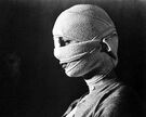
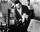
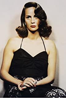
A movie with a very complete structure. The theme is really good. It can be a big book, but it seems that the screenwriter didn't want to dig deep. Since they are called the faceless eyes, the hidden metaphors of the face and eyes can be fully expressed through the portrayal of the heroine. The images of professors and assistants in the film are still quite contradictory and full, but the heroine is too thin, especially the last turning point is not enough, the basement scene simply gives people a kind of showy feeling...I have to mention that the white hand is held at the end. The end of the pigeon going into the dark is very good.
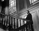
I don't see many old movies. I always feel that this director is not very good at using lenses. Close-ups are really messy, either panning left or right or not moving at all. . At any rate, this was also taken in '59. . The lighting of the stairs was great, but the useful symbolic props such as the mirror are always used in soy sauce inexplicably. . The transition has been unable to complain, and the black screen continues the next paragraph, you are between the scenes of the drama.
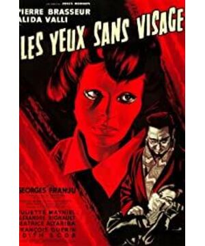
I feel that the cover of CC is really amazing, it directly brings out the atmosphere of the whole film and definitely adds points to the movie. The heroine's mask is very beautiful, very light and elegant. I still like the concept in "Painted Skin 2", everyone has a face and always ignores the light in the eyes.
View more about Les yeux sans visage reviews


