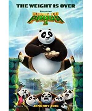
The quality of "Kung Fu Panda 3" has improved compared to the second, and it is about the same as the first. Kung Fu Panda 3 is like an all-rounder, top-notch in every way.
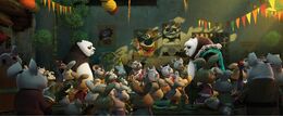
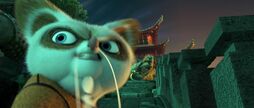
The picture is beautiful and full of a strong Chinese style. The quiet and simple panda village, the meticulously crafted ink paintings, and the "qi" at the center of the whole film have all become the highlights of this film.
The lines are more clever and appropriate, and the laughter is dense, which has created the most in the series. It is worth mentioning that, in order to integrate into (cater to) the Chinese market, the film has specially made changes to its mouth shape as the locals do.
The action design of the film, as always, is smooth and free, and it interprets Chinese Kung Fu incisively and vividly, which shows the power of Hollywood.
In addition, the film's soundtrack is also extremely successful in localization, accurately grasping the connotation of Chinese style and Chinese Kung Fu, and there is no sign of acclimatization at all.
The story of a movie is software, and photography, soundtrack, special effects, etc. are hardware. If a movie has good hardware but poor software, it is a failed movie. If hardware is poor but software is good, it can be called a good movie. And the software is very good, it is a good-looking good movie. "Kung Fu Panda 3" belongs to the first-class level in both software and hardware, so it is popular all over the world, both Chinese and foreign.
Of course, there are still some unsatisfactory points in the film's storyline and story rhythm, but this is not important. After all, DreamWorks Animation is not Pixar. Pixar is responsible for innovation, and DreamWorks Animation's task is to spoof, that is To be cute is to let you walk into the theater without your brain, and then come out with laughter.
View more about Kung Fu Panda 3 reviews


