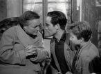
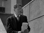
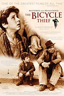
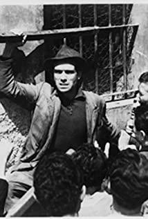
I think this is attributed not only by intriguing blocking and compelling performances, but also the use of paralleled compositions. The use of matched framing from cut to cut, particularly in horizontal space, is more frequent than I've noticed in the three previous films I've ToneCut.
The use of paralleled compositions tricks the eye into passing over the cut simply because the eye is not forced to re-direct to a new position. It's already where it needs to be to see the focal point of the next image.
Watch the clip I posted and see for yourself the delicate care taken by DeSica and Carlo Montuori in making the connecting shots happen. Really the whole film is like this, but I just wanted to at least provide a small slice of what's going on here.
That's an incredibly powerful tool that is often forgotten and can really get you past the proscenium arch and get you into the film. I wrote previously about a conversation I had with a co-worker about how there's a distance in both performance and cinematography in Citizen Kane that is just more difficult to sympathize to the story at all. I would theorize that perhaps part of the problem is that the cinematography and, in particular the cuts, call attention to themselves and don't guide the eye as gracefully as Bicycle Thieves does. Instead, Citizen Kane hosts stark cuts with focal points all over the screen. It's not as comfortable to watch, and therefore is less inviting to sympathize.
One could argue that Citizen Kane thrives rather than suffers from this approach, because Charles Foster Kane isn't supposed to be a likeable character, so sympathy isn't required and the dissonance of a lack of grace in the framing and cuts helps present his character in that manor.
In 'Directed by Steven Spielberg: Poetics of a Contemporary Blockbuster', Warren Buckland analyzes Spielberg's successes and failures in using matched framing from cut to cut. Early on in his career, his attempts weren't nearly as successful as when he hit his stride in doing so. And although I haven't given a deep analysis of any of his films yet in this ToneCut style (I will, don't worry), his parallel compositions are like punctuations or signposts throughout the film rather than part of the continual style of the story as in Bicycle Thieves. Perhaps the best example of this is the use of the Paramount logo fading into the mountain peak at the beginning of Raiders of The Lost Ark. When used correctly, it's a brilliant submersive effect that invites the audience into the story.
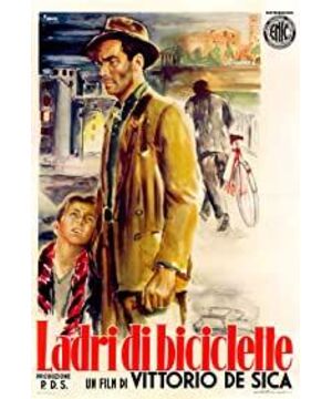
At first I thought the cuts in Bicycle Thieves were just coincidental in how graceful the cuts were, but as I made my way through the whole film, I realize that DeSica masters this. The affect of this technique in Bicycle Thieves really is one of the best examples of invisible cuts in the history of cinema. Are there any other films that you can think of that employ the same idea? I'd love to take a look at them and I'll add them to the list of films to look at in ToneCut form.
Again, I'm willing to share the full ToneCuts I've done, just so long as you provide me with a writeup of what you've noticed throughout the film as well.
View more about Bicycle Thieves reviews
