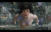
After 22 years, the 95 version of Ghost in the Shell ushered in its live-action remake. Aside from "Cyberpunk 2077" and some widely circulated meal clips, this is also the orthodox cyberpunk aesthetic expression with the most advanced special effects in fact. What is even more commendable is that the correspondence between the 95th and 17th editions is quite neat.
So I thought, maybe comparing the image features in the old and new versions separated by a whole generation, we can extract a lot of conceptual elements, and even get a glimpse of the idea of the cyberpunk-style prototype design, and show it to the next cyberpunk. The sequel to the genre leaves something to be desired.
Before we start, briefly talk about my evaluation of the film on the "cinematic" level. The main line of the film is very clear—or rather mean, superficial—that is, an American heroic story about Scarlett whose memory was overwritten after a brain transplant, and beating up a reckless capitalist in order to regain her identity. Very popcorn, very Hollywoodish. Overall, the graphics are well-crafted, the plot is decent, and the text is a little too bland. Aside from all Shirou's authentic preconceived ideas, at least you can get a passing score and imagine that it is just a Transformers-like movie that takes place on a "stage with some elements of the cyberpunk worldview", which is easy to understand.
The text below is roughly in chronological order in which it appears in the film. Some particularly obvious cyberpunk common designs will be skipped, such as armor prostheses, monitors, blindfolds, rain, Sino-Japanese culture, ancient buildings, codes, cars, glitch art, neon lights, jackets, sex.
The opening paragraph of the new edition corresponds to the process of making a prosthesis in liquid in the 95 edition , which is completely copied.
Would like to talk about why prosthetic manufacturing uses such a design. For example, it is even better to describe the extremely complex mechanical mechanism and operation steps, which can create a visual impact. My understanding: 1. By analogy with the birth of a baby in amniotic fluid, it can reflect the natural "divine nature" of the prosthetic body, thus accusing the attributes of "human" and weakening the impression of "mechanism"; 2. Lazy: although the 95th edition does not It is taboo to show complex muscle structure, but the workload of actually drawing the process of assembling the prosthetic parts is huge, and I don’t do things that show off skills and burn money.
Spontaneous winding and connection of synapses between the brain and trunk . This is a new design. The 95 version only has the scene of putting the brain into the body, which reflects the mechanical frustration. The treatment here is more ambiguous, softer, and more "biological", which is a nice innovation. But in fact, it is not self-created. Some netizens mentioned that the concept of "spontaneous search and active connection" of this synapse can be seen at least in Avatar.
The face is detachable with several components . This is used in many places in the film.
In addition, various types of cables are also very common features. There are many kinds of cables, but I think the sensory experience of different cables is different. For example, the sturdy cable groups that are laid on the ground without any concealed works, the overhead cables tangled in chaos on the street, and the cables hanging from the back of the head, express different meanings. The cables used for the transmission of the spiritual world here must have a certain sense of heaviness, reminiscent of blood vessels, in order to reflect the huge amount of information. There are more and thicker scenes like this in The Matrix, so I won't take screenshots.
From a machine to a human body , it has to pass through a layer of film and wrap it in a white liquid, and then the white shell is removed, and the "skin" is exposed. The two versions are basically the same. One of the details here in the 95th edition is very interesting. When passing through the interface, there will be "bubbles" moving upward, indicating that this layer of white phase interface is not water and air, but a liquid and another liquid.
Open your mouth to breathe when you wake up , like a baby. In fact, it validates the reason I mentioned earlier about using water to make prostheses. New idea, but a bit deliberate. (Maybe it also reflects the level of the director...)
The processing of version 95 is the digitization and blurring of sound and images, and it is more mechanical.
Geisha . The idea comes from the 04 edition, and the geisha is chosen as the carrier to display attack, disguise or virus invasion, because of its natural beauty, weirdness and "tool sense". When attacking, the face mask opens (it can be fully or half-open), exposing the barrel; it can change into a crawling form.
Depicting virtual spaces with lattices and " low-resolution 3D models " can also be used for virtual blocks in the real world (such as conference rooms). This is a commonly used design in relatively new movies. An example that may be familiar to more people is "Cyberpunk 2077". Films of the past preferred to use fluorescent green dotted surfaces to depict virtual spaces, often with scan lines (similar to radar), presumably to mimic the feel of a spherical picture tube/screen. In fact, although high-tech in cyberpunk is a very basic setting, in the technology part, a certain degree of deliberate "old-fashioned" is very necessary to show the separation of the bottom-level people and the top-level capital.
The composition is classic, waking up from a bed silhouette of a cyberpunk city outside the window frame . I prefer the new version, which shows the "middle" of the city - no road or roof, increasing the sense of oppression. The design of the bed is slightly random, focusing only on the sense of the future, ignoring the rationality. I don't want to put pillows and quilts, which are too household objects, maybe it is a better choice to make the bed into an adaptive memory material. But maybe it's just a matter of setting uniformity, as illuminated corrugated plates are a relatively common design.
The holographic projections that can be seen everywhere , just cut a few. The 95 version has almost no hologram on the exterior wall, and mainly relies on billboards to create bizarreness. Although holography is "the standard configuration of cyberpunk", it does not fit well, and it is a quite failed design, especially the first picture. Think about it a little: on the one hand, it is difficult for a broken physical entity to support such a "beautiful" hologram, but the rotten door frame shows a flawless hologram, the sense of game is too heavy, and the sense of violation is very strong; on the other hand, the hologram The high-tech represented should not have too strong public welfare and popularization. In contrast, a large number of holographic advertisements on skyscrapers are full of eyeballs, giving people a feeling of crampedness, and reflecting the control of capital, which is necessary. , and the holograms used by each household to display basic information are a utility and do not make sense.
In addition, the first picture appeared 20 years later, Ele.me. How should I put it, it's too lazy to carry a bag with an inexplicable shape to reflect the sense of the future.
Ring-shaped surgical robot . The feature of the girdle is used in quite a few places, such as the eye patch, to reflect the complex functionality and blindness of vision. Even Bart, Major, and V's jackets have looped collars. (But the relationship is not very big, no screenshots)
Yet another example of a removable face component . In fact, it also suggests that the opening methods of different prosthetic faces can have different designs.
The movement of the yellow light spot on the cable is used to represent the transmission of data. The 95 version does not have such an explicit design of data transmission. The light spots are irregularly spaced and their movement is deliberately slow, which I think is nice. My first thought was to simulate the invading blood vessels of parasites/subcutaneous organisms, and the second also felt a bit like air bubbles in an infusion tube during an IV. Not sure where the real inspiration came from, but the design feels a certain amount of physical discomfort at first sight. In a word, instead of using the extremely fast blue pulse signal, the information is brought to life by the slow wriggling yellow light spot - life and in vivo, giving the impression of biological movement.
Perform hacking with human drag . Thanks to the special effects, although it has a more biological taste, the traces of plagiarism are too obvious, which is not good.
The face is shiny and oily . remember who...
film . Film is also a common element, a material with a sense of cheapness, life and the future. The clothes worn by the garbage truck driver are thicker in the 95 version, and have been changed to plastic film in the new version, which is more technological.
animal . The real creature is a unique existence in the cyberpunk worldview, pure, plain and hopeful. Many works will use a very small amount of "primitive" creatures to represent a pure land, and the source of creativity should be the remains of Blade Runner's nuclear war.
It's too depressing, it can be described as a public housing with a close-up shop . The ultimate in tightness and compact beauty. This scene is very good, and it feels like the ones looking up at the sky.
Grass, trees, pools . Similar to the role of animals, it expresses the luxury of pure natural things.
The definition of cyberpunk is hard to find boundaries, especially at the level of imagery/symbol/aesthetic character. The spiritual core of dystopia is recognized by everyone, but it is difficult to say what physical elements must be included to be called cyberpunk, or what are missing are not called cyberpunk. For example, there are no psychoactive drugs in Shell, Akira has no neon lights, Blade Runner has no prosthetic replacements, and The Matrix has no armored vehicles... So the tributes everywhere are what recent cyberpunk works look like. Things move in a spiral, and while there's been an apparent lack of innovation in cyberpunk lately, I'm not pessimistic. Decentralize and popularize the magical side of cyberpunk in a way that has a stronger sensory impact, and the accompanying philosophical thoughts of existence and nothingness will also permeate. I believe a new wave will emerge with advances in real-world informatics and biology.
View more about Ghost in the Shell reviews


